By Melanie Micir and Anna Preus
In 2017, we set out to create a digital edition of Paris that would make the poem more accessible for contemporary readers. With an explicit investment in feminist digital approaches, and with contributions from an interdisciplinary team of faculty, postdoctoral fellows, library staff, and undergraduate and graduate students, we have worked to recreate the 1920 edition of Mirrlees’s poem in digital form. But just as Mirrlees’ writing challenged printing conventions in its time, the poem challenges systems for representing texts digitally today, and attempting to recreate its complex visual design has required us to mimic printing decisions made a century ago using digital tools. What follows is a short description of the process through which we digitized the text.
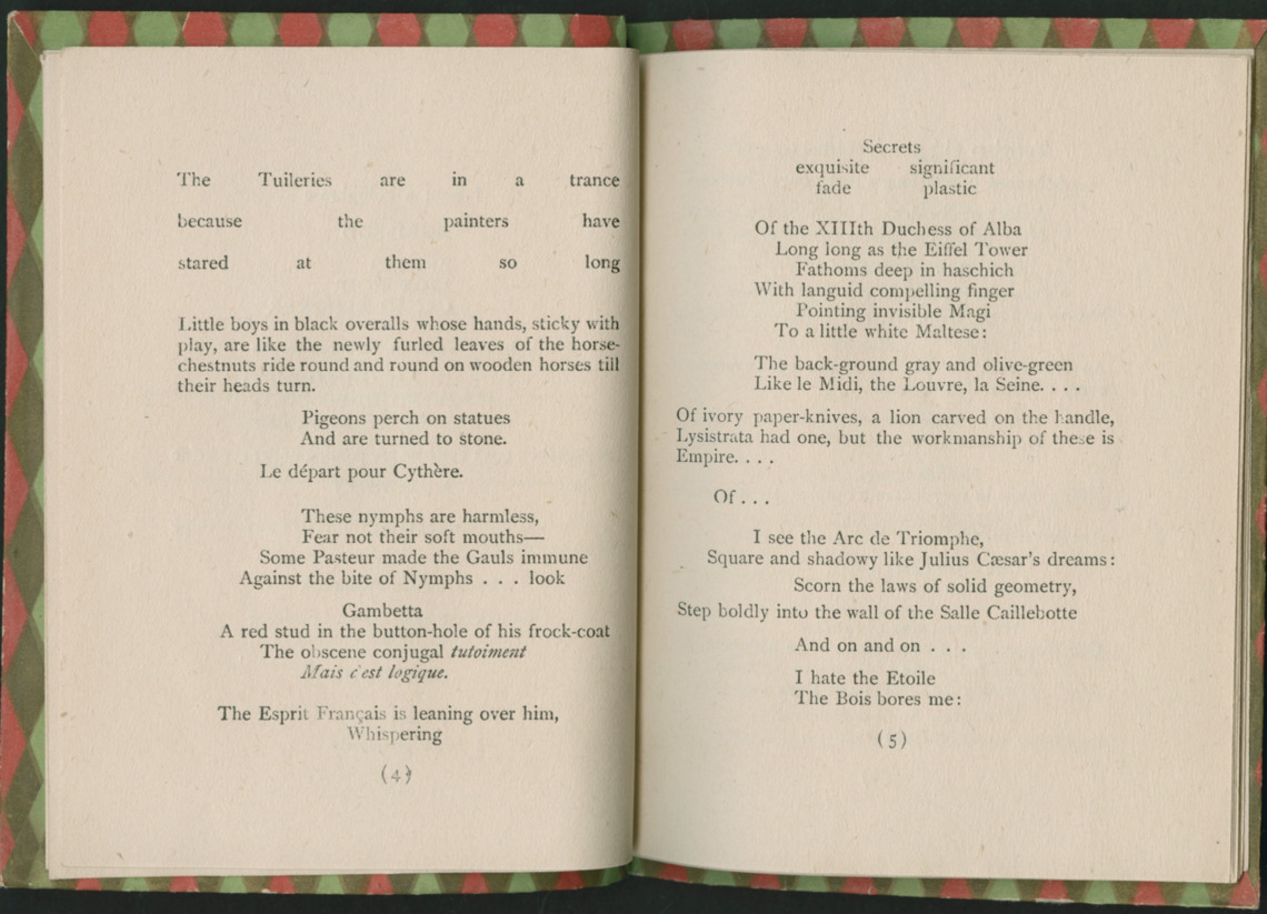
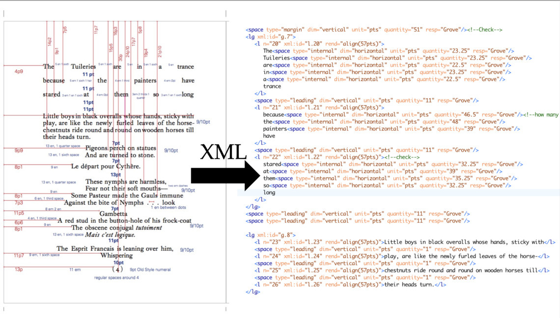
In the first year of this project we were fortunate to work with Jaleen Grove, a historian of illustration and graphic design, who encouraged us to look not just at the words on the page, but to see each page as a visual construction in its own right. Given the poem’s layout, the idea that it existed as both text and image conceptually made sense to us, but it was hard to build that idea into the structure of our digital edition, the basis of which is an XML file that adheres to the Text Encoding Initiative (TEI) Guidelines–a collaboratively built schema for marking up texts in a form that is both human- and machine-readable. Recording the poem’s original layout within the TEI guidelines for encoding verse posed challenges, though, since the spacing and layout of the poem is so varied.
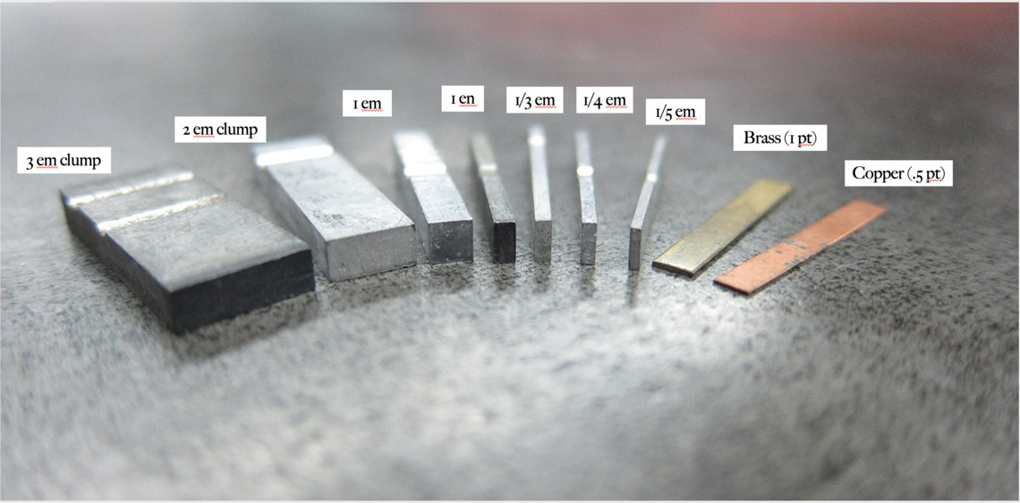
Ultimately, what helped us address this issue was a return to the methods that Woolf used when publishing Paris. She printed the book on a small press in her dining room, and all she had to work with when creating the layouts for each page were pieces of moveable type that, when inked, made impressions on rectangular surfaces. Focusing on the typesetting process in turn brought our attention to something we did not initially see: whitespace. In letterpress-printed text, whitespace is created through the insertion of individual pieces of spacing material, which function just like regular type but do not make a mark on the page. Wherever Woolf wanted to create spaces in Mirrlees’s poem, she had to insert spacing material, and it was the insertion of these pieces of spacing material that made the complicated layout of the poem possible. In order to copy her layout while preserving the poem as text, we would have to insert individual blocks of digital spacing “material” in our edition as well.
Jaleen began by measuring the placement of each line of text and each character within the lines, but promptly ran into issues because all the pages were slightly different sizes and at odd angles due to the stapled binding. To address this, she created high-quality scans of the book, measured the dimensions of each page, averaged the measurements, established idealized page dimensions for our edition, and then recorded measurements for the placement of each word in the poem in documents representing these idealized pages.
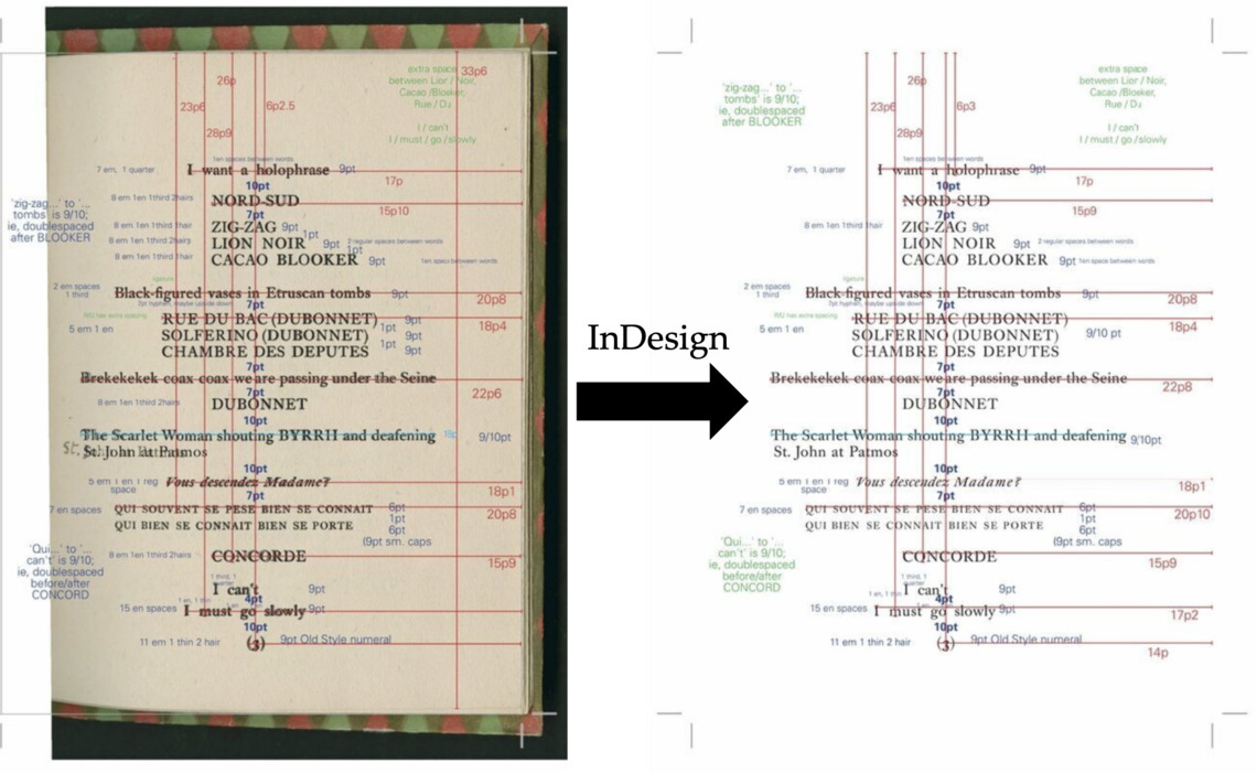
Once all the measurements for a page were recorded, we encoded those measurements in our TEI transcription of the poem. However, because we were capturing so many visual details, we ran into issues using the TEI standards for encoding printed texts and had to turn to manuscript studies conventions. Moreover, because we were measuring to the typographic point–which is 1/72 of an inch–our measurements could not be represented through standardized spacing in modern digital typefaces (in which a space is a character with particular dimensions). Instead, we had to insert custom space elements (or tags) with exact dimensions for each bit of whitespace on each of the 23 pages in the printed book. These space tags conceptually correspond to the metal spacing material Woolf used to create whitespace in the printed edition.
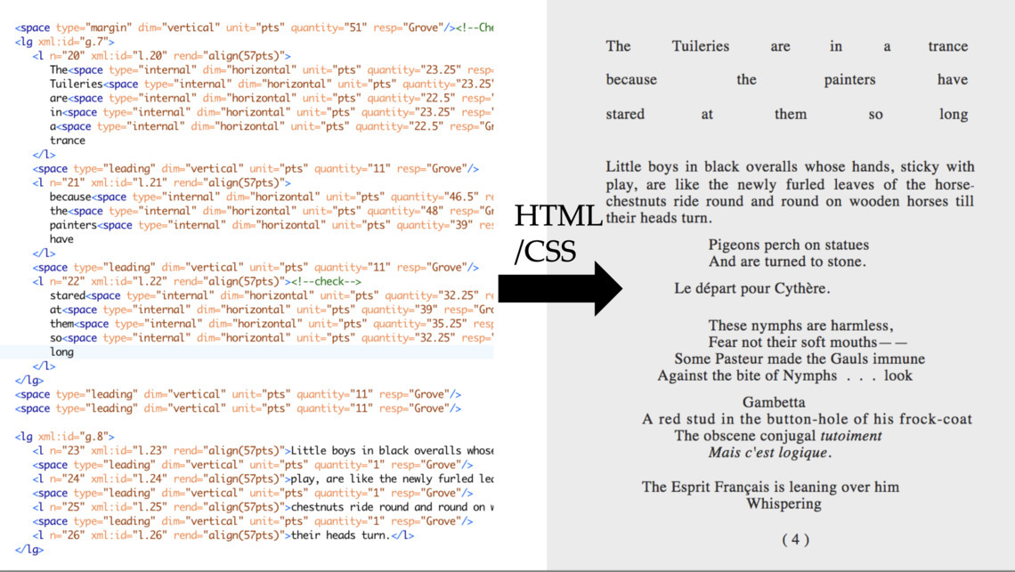
With the transcription of the poem–and its layout–complete, we then turned our attention to putting it online. We used TEI Boilerplate, a tool for publishing TEI files, to translate our transcription into HTML. With help from Doug Knox and Steve Pentecost, we customized the display and then wrote hundreds of style rules in CSS, so a web browser could interpret each of the custom space tags we had created to represent the whitespace in the poem. We also created options to allow users to select different views of the poem: for example, the default view for the digital edition presents the poem as a continuous scroll, but readers can view the original page breaks, margins, and page numbers by selecting the “pages” view.
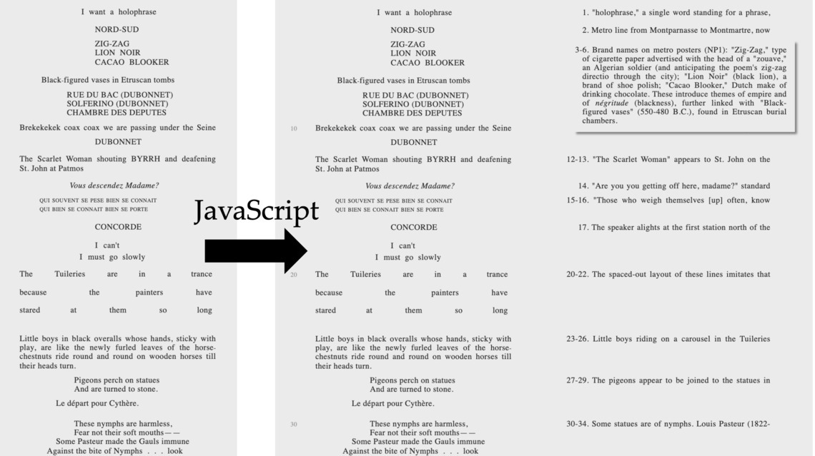
Throughout this process, we also continued thinking about how to contextualize the poem for contemporary readers. We sought permission to include Julia Briggs’s foundational notes on the text, encoded them in XML, and created options for viewing them alongside the poem. Sophie Levin and Ann Marie Jakubowski contributed historical essays, and Sophie also gathered all the historical images included in the edition, which we also created options for viewing alongside the text.
Finally, we created this website using the minimal computing platform Wax in order to bring together the materials we digitized, collected, and created during the process of remediating Paris, and to hopefully introduce the poem to new readers.
The project has been shaped throughout by a generous group of collaborators without whose contributions this edition would not have been possible, and we are immensely grateful for their work.